
One of the most important components of a branding campaign is an excellent logo. As most of you would notice, majority of dental surgeon logos look strikingly similar and create little differentiation from one dental practice to another.
A dentistry good logo is one that takes design one step further. Instead of making an eye-candy, a well-designed logo is one that was created with a unique perspective and intelligence to see thing differently from the rest.
The following dentistry logos below will provide you with a good dose of inspiration so you’d inject a little more creativity into the logo design process. They will definitely make you smile in awe at the brilliance of the execution of the idea that it presents several layers of meanings to consumers. Some of the logos below are astonishing in their conspicuousness while others shine in their hidden secrets comparable to the likes of Colgate Palmolive.
Country Living Dentistry
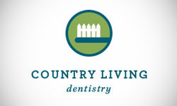
1 In this cleverly executed logo, white picket fences, which are the perfect symbol for country life, serve as toothbrush bristles. This logo works well because it immediately means two things at once and tells consumers that the company is all about – dentistry in the country side. Furthermore, the white background makes the entire thing uncluttered and elegant and at the same time helps the viewer find and zero in on the logo quickly.
Innovative Family Dental Health
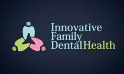
2 Just like the Country Living Dentistry logo, this one makes use of visual double entendre to indicate two things in one: three people holding hands to symbolize working together towards better dental health and three teeth to represent dentistry. The dark background strongly contrasts with the light-colored image and makes the overall look striking and noble in spite of use of pastel colors for the image.
Huzur Oral and Dental Health Center

3 This logo makes use of a dominantly blue palette, which denotes peace and a sense of ease and can be associated with the feeling of soothing. The image in the middle takes advantage of the negative space to carve out what looks like teeth and to make a big letter H for Huzur.
Empire Dentistry Logo
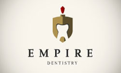
4 If you look at the image without reading the dental practice’s name, you’ll notice a gladiator’s helmet, which symbolizes an empire. If you look more closely, you’ll spot a cleverly set tooth in the negative space. The word “Empire” is in bold serif typeface to connote class, nobility, and seriousness in the manner that the dental practice renders its services.
City Dental
5 The bright background color provides sharp contrast to the white image and company name and helps them stand out. So that they can imply that the logo is for a dental practice, they utilized a toothbrush as the central image. However, they added small details such as making the bristles look like sky scrapers and making the toothpaste look like clouds hanging over the city. This logo is very smartly done and drives its point across.
Robin Rutherford, DDS
6 The logo for this dental practice makes use of overlapping transparent shapes in order to create an image of a tooth and at the same time a heart. The tooth is able to inform viewers about the kind of service that the practice offers. The heart, on the other hand, hints at the level of personal care that the patients receive at that dental practice.
Dental Experts

7 Dental Experts makes use of a visual trick in their logo. By using symmetrical curves, they were able to create what looks like a set of teeth or a team of dentists. The subtle suggestion that the logo invokes is that you will be in good hands with a team of professional dentists under Dental Experts.
ODC Logo
8 This logo employs a commonly used palette in dental logos – blues and greens. The color scheme symbolizes softness, ease, and comfort, which are feelings that dental practices want their patients to have while under their care. Using a dental mirror to create the letter O is a nice touch that portrays ODC’s professionalism and precision.
These days, the best logos are those that immediately grab the attention of viewers and then subtly work to express their business nature and ethos. As you can see, most of the examples above are not all bells and whistles. Simplicity is often the key to a successful logo design that will enhance the persona of a brand.


